
·
TANO
Graphic Charter · Brand Book
Tano, a clothing brand in need of branding, draws its textile references from nature, particularly from plants found in the nearby natural environment.
Its branding image, represented by a leaf, reflects its commitment to authenticity, sustainability, and connection with the natural world.


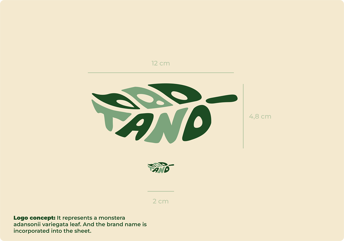
The Logotype
Here's my progress on developing Tano's brand identity, kicking off with the logo design.
Here's my progress on developing Tano's brand identity, kicking off with the logo design.


The Colors
Next, the color selection naturally gravitated towards soft hues, hence the choice of cream, which complements the green, reinforcing the connection with nature.

The Typography
I carefully selected the typography to reflect Tano's personality and values. I opted for fonts with distinct character traits like elegance, simplicity, and readability to ensure consistency across all our brand communications.
I carefully selected the typography to reflect Tano's personality and values. I opted for fonts with distinct character traits like elegance, simplicity, and readability to ensure consistency across all our brand communications.


Application
Here are different logo applications to better understand its usage, such as on a bag or various clothing labels.
Here are different logo applications to better understand its usage, such as on a bag or various clothing labels.


